When I saw the new kit by geniaBeana Scraps and Cluster Queen Creations I was so excited to get scrapping. I had just taken the perfect pictures.
First let me share the story:
My kiddos love to put on music DVDs and dance around. And I'm not talking little kids music either. They prefer the real stuff and good stuff at that: David Crowder band and Mute Math are favorites right now. Often times the hockey stick is transformed into a rock'n guitar for the occasion. The other night was no exception. My four year old picked it up and started jamming. My little girl was upset that he was not sharing, but before I had to intervene and set up a sharing schedule, she had a light bulb moment, ran to our toy shelf, and dug around until she found a tiny guitar puzzle piece. Then she joined right in the jam party.
And here is the layout I made:
I love how it turned out. Oh, and while the layout is mostly about my daughter, isn't my son so cute just jamming away!
If you are interested here is the kit. Again, I can't say enough about how much I love this kit. I'm itching to use it for another layout.
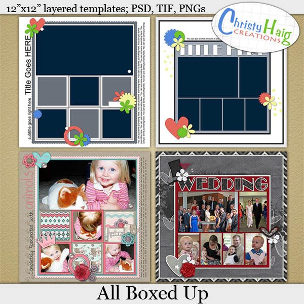
And I also used one of these templates for the layout:
Saturday, September 29, 2012
Saturday, September 22, 2012
Time for another freebie
I should tell you that I love using templates to create my layouts. In fact in a way I always start with templates. I either pick one from another designer or I create my own template at the beginning of the layout. When I do this I will figure out what pictures I want to use. Then I will open a blank canvas and start creating a template that incorporates that many pictures in a way that will really work for my photos. Then I add shapes for the papers and elements. Only then do I start adding my actual pictures and papers/elements from the kit. I think it is my left brain nature that likes to design in basic black and white and gray shapes first and then add the "artsy" things. I feel like I can just see the layout design better if I template it first.
So I have polished up a couple of my rough templates from some of my favorite layouts and I want to share them with you today. You are getting a bonus of two templates in this pack since they work together so well. :)
Here are the layouts that inspired them:
Credits: Little Black Dress by WM[squared] and Dream Big Designs, font is Sylfaen
Credits: Best Furry Friend Collab by Find Your Bliss Designs and Sugar Fancy Designs, font is Elicia by Darcy Baldwin
And here are the templates for you. I hope that you enjoy them. :)
**DOWNLOAD EXPIRED**
And to show you a bit of how fun and versatile templates can be, I liked them so much that I did a second layout using one of them. Since it was a different theme and totally different kit type, I love how the layout came out looking completely different even though I didn't rotate it or change it much.
At the playground and Olphelia Scribbles font by WM[squared]
Have fun with them and if you download them I'd love to hear from you in the comments or see your layouts in the galleries!
Monday, September 10, 2012
Warping shadows in PSE
One of the challenges at ScrapOrchard this week is about warping shadows. AND they have a fabulous tutorial for PSE users. The trick for PSE users is that you have to create a shadow on a separate layer which takes a few extra steps, but then it is easy to stretch the shadow around and get it to look like parts of elements are lifting further off the paper than others.
Let me show you what I mean. Here is the layout I did for the challenge:
Can you see the string at the bottom of the layout? I stretched or warped the shadow at the tips to make it look like they float above the page higher than the parts of the string that tuck under the photo. This really helps it look more realistic. I also warped the kite string and the butterfly shadow. On the butterfly you can really see it - the left wing looks bent up a bit higher than the right.
Oh, and I loved how the layout turned out. They are some of my favorite pictures from last spring and I used this great kit by WM[squared]:
If you would like to try this out or play along with the challenge at ScrapOrchard, here is the great tutorial I mentioned:
http://scraporchard.com/forum/showthread.php/20732-Warping-Drop-Shadows-in-PSE
Wednesday, September 5, 2012
"Un"Theming Kits
I wanted to share with you a layout I made today for two reasons.
First, I have to show you my super cute daughter and her new bike. She is soooooo proud of it. After being jealous that both her brothers have bikes for a while, I finally found one her size listed on craigslist. She was so excited when we picked it up and wants to ride every day. Her two thrills: She can ride in the street with her brothers and the bike has a horn!!
So next I wanted to share with you because I ran into what I thought might be a dilemma when I went looking for a kit to scrap with. I really wanted to use a kit that I already owned and I wanted it to be bright and match the pink in the picture. Looking through previews, this one by Jady Day Studio caught my eye:
However, you will notice that the kit is truly an Easter kit and my bike pictures are not at all Eastery. When I looked at the kit, though, I noticed how many gorgeous elements were included that were very cutesy and girly but not only bunnies and eggs. So I took on the challenge of using a Theme kit to scrap a layout that doesn't match the theme.
And I'm thrilled with how it came out!!!! What do you think?
To help me out I also used a great template and font by Darcy Baldwin.
Saturday, September 1, 2012
Chore Chart
My kids love playing video games and I am never sure I how to best allow them the fun while still keeping a healthy limit on their "screen time." At our house, we have settled on having the kids do chores to earn video game time. So I found a whole bunch of apple shapes that I had left over from teaching. I wrote "5 min" on each. For doing small chores, the kids earn 1 apple and for larger chores 2 apples. I even thought to add that I will take away apples for complaining about chores which has been a huge blessing.
I love the way it turned out:
After creating the chart and having so much fun with this kit, I decided that I would scrap a layout about our chores for video game routine.
When I saw this kit by WM[squared] and Studio Jen D I knew it would be perfect to create a chore list for the kids:
I love the way it turned out:
After creating the chart and having so much fun with this kit, I decided that I would scrap a layout about our chores for video game routine.
Subscribe to:
Posts (Atom)